 |
| Google Tasks logo |
Anda berbicara bahasa Indonesia? Baca artikel terjemahannya di sini!
Believe it or not, to-do lists have played quite an important part in my life. They (obviously) help me keep track of my tasks, my shopping lists, and even my blogging process. I do admire Apple's Reminder app, as it is simple, user friendly, and just works. It effortlessly and automatically syncs across your devices (mac, iPhone, iPad), so the principle of 'write once, see everywhere' is gracefully and elegantly applied here.
I wish I could've said the same about Google, though. For some reason, I cannot bear using iOS as my primary mobile OS, so I cannot maximize that Reminder app's full potential. Unfortunately, Google didn't have the same app that works as good as Apple's Reminder. They do have Keep, but you can't possibly call keep a full to-do list app, no? For me, Google Keep is more like a versatile, all-in-one notes app, which is not what I'm looking for. I could also use Google Calendar, but I also wanted my calendar to be clean as well. If I'm not mistaken, Google also had some kind of a task app, but it was unintuitive, and well hidden in Google Calendar.
I've also tried using third party alternatives such as Any.do, Wunderlist, and even Microsoft To-Do. While they're not bad, I want a first party solution, which is created by the same company who develops the OS. Why, because their app will have the same design language as the target OS, something that I hold dear. Besides, we had something called 'Organizer' during the feature phone days. Why can't we have the same thing in modern OSes?
Enter Google Tasks. This newly-released app is Google's latest attempt at making a first-party to-do app. As soon as they announced it, I was thrilled. From the icon alone, it seems like Google is finally putting an effort into this. I even went straight to APKMirror to download the app because at the time, it wasn't available in my country's Play Store. My initial impression was promising, and I've been using it for a few weeks now. I'm ready to share my opinion about it. Stay tuned.
Material Design Takes The Lead
 |
| Material design is reflected in the splash screen. |
Google's material design is the design principle for both Android and their apps. Look at their other apps (GMail, Google Search, Keep, etc.) and you'll see what I mean. The new Google Tasks is no exception. I personally like it, though. It's simple, minimalistic, and somehow, that illusion of 3D depth is satisfying for me.
Simplicity is Its Power
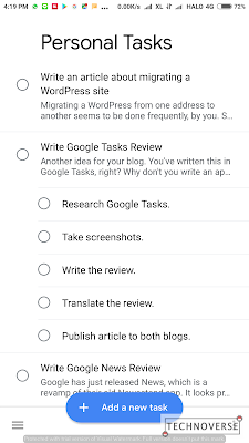 |
| List of tasks |
Ever heard of the phrase "less is more"? That's exactly what I think of Google Tasks. It has only the essential features: list, task, subtask, description, and due date. Unlike other tasks app, Google Tasks doesn't support location reminder or comments. Those features might be added later via updates, but for now, for me, personally, Google Tasks is front-and-center, and is sufficient for my needs.
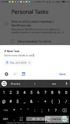 |
| Adding tasks |
Adding tasks is simple. Just click the "Add a new task" button and add your task. While adding your new task, you can also add a due date and description. Want to edit your task? Just click on the task, and edit away.
 |
| Details of a task. |
Unfortunately, subtasks can only be added when editing your task. Also, subtasks don't have their own description and due date. You might want to be as descriptive as possible in the title to prevent confusion in the future.
Manage Multiple Google Accounts
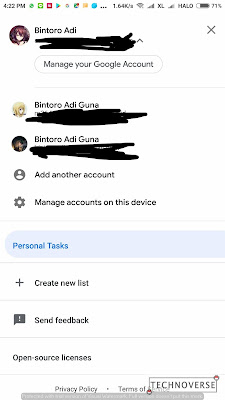 |
| Google Tasks allows you to manage tasks on multiple Google accounts. |
Just like many other apps by Google, Tasks also allows you to add and manage multiple Google accounts. Each account will have their own data, so you can separate the tasks between your business and personal accounts.
Google Tasks is also available on iOS and the web. I haven't tried the iOS app, so I can't comment on it. However, its web app is integrated into the new GMail interface (yay, more material, more condensed) along with Keep and Calendar.
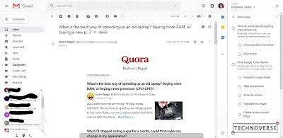 |
| You can access Google Tasks web client right from the GMail. |
What's great about Google Tasks' web app is that it shares similar features to its mobile counterpart, albeit being smaller. Sharing the same space with GMail should improve your productivity, as you can immediately create tasks as soon as you receive and email for them.
Conclusion
As a man who loves simplicity and minimalism, I must say that I like Google Tasks. This latest attempt at to-do list by Google seems to be working well, at least for me. It has all the necessary features in a simple, user-friendly interface. It also incorporates material design, which is a plus if you're using Android.
Pros:
- Material design
- Less is more, only the essential features in a user-friendly UI
- Cross platform
Cons:
- Unable to add subtasks when creating a task
- Subtasks don't have their own description and due date
So, do I recommend Google Tasks? Hell yes, if you are someone who is looking for a simple, front-and-center to-do app. If you are looking for more, though, I'm afraid you'll have to look somewhere else.
Well, I guess that's all, Folks. As usual, if you have any questions, sound off in the comments section below. The review is short, yes, because the app itself is simple and minimalistic, so there's not much to write about. Anyway, thanks for reading and see you in the next article! :D


Comments
Post a Comment